


Toasting Life’s Moments with Moet & Chandon and Veuve Cliquot
Moët & Chandon — Brand Communications
Key highlights
Creative leadership for global luxury brand communications
Balanced heritage with contemporary expression
Emphasis on clarity, polish, and brand confidence
The challenge
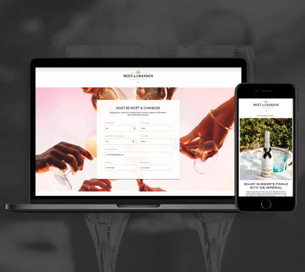
Moët & Chandon carries global recognition and a celebratory spirit, but with that comes high expectations around consistency and polish. The challenge was creating work that felt elevated and relevant while staying firmly rooted in the brand’s established identity.
The work needed to feel effortless—never loud, never trendy—while still supporting evolving communication needs.
My role
Led creative direction and design execution for brand communications
Worked closely with teams to translate ideas into refined, brand-aligned work
Ensured consistency across materials without flattening the brand’s personality
How it came together
The focus was on refinement rather than reinvention. Typography, imagery, and layout were handled with care, allowing the brand’s inherent confidence to come through without added flourish.
Each piece was designed to feel polished and celebratory, but controlled—supporting the brand’s global presence while maintaining a sense of ease and clarity. By keeping the work grounded in the brand’s core principles, the result felt both current and timeless.

Veuve Cliquot
Veuve Cliquot — Brand Communications
Key highlights
Creative leadership for a heritage luxury brand
Work grounded in restraint, proportion, and detail
Strict adherence to established brand standards
The challenge
Veuve Clicquot is an iconic brand with a strong point of view and a long visual history. The challenge was supporting communication needs without disturbing that balance—no reinvention, no unnecessary embellishment, and no room for error.
The work needed to feel confident and contemporary while remaining unmistakably Veuve.
My role
Provided creative leadership and design support for brand communications
Worked within tightly defined brand guidelines
Partnered closely with client and internal teams to ensure consistency and precision
How it came together
The approach was intentionally restrained. Design decisions focused on hierarchy, spacing, and tone—allowing the brand’s existing assets to do the heavy lifting rather than introducing new visual language.
By staying close to the work and paying careful attention to detail, the resulting pieces felt natural to the brand: composed, confident, and quietly expressive. The goal was not to stand out, but to fit perfectly—supporting the brand’s presence without drawing attention to the design itself.

More Case Studies:


